
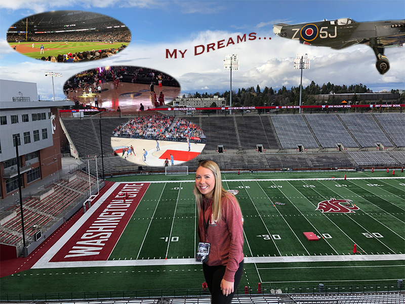
Idea & Inspiration
This photo I created depicts a story of my planned path to my future career. The background image is where it’s all going to start. In the heart of Martin Stadium, working with Washington State University athletics in the marketing department. Currently I work in the stadium as a game day intern. From this position, I hope to gain experience to eventually be promoted to a full-time marketing intern. These positions will help me take steps to my future dreams of working at the college level and hopefully one day to obtain a position under a professional sports organization. I gained insight and inspiration from a few places. One of the sources included a podcast from a woman in the same career industry. This sports management podcast outlined her path and the steps she took to get the position she has today.
Considering my idea for the brochure, I used my inspiration files that consisted of various college programs in the industry. Their brochures often depicted students in the industry. These students were working hands on in a sports venue including arenas and stadiums. One specific pamphlet from Cazenovia College displayed a student on a soccer field and listed other internships he had gained through their Sport management program.
Technical Detail
The images I used in the mind bubbles are depicting similar steps the woman from the podcast took to become successful. To create these bubbles, I placed embedded images I had taken at various professional sports venues. I then used the elliptical marquee tool to create the shape. I took the idea from the brochures and decided to use Martin Stadium as my base layer. I later placed an embedded image of myself and used the magnetic lasso tool to cutout my figure. Once all images were embedded and cutout I used the move tool to place the photos in the correct spots. Using the text tool, I created a title of the brochure and utilized the warp text future to create a flag being pulled by an airplane. A few challenges I encountered was ensuring that my images were transformed to the correct scale without warping or shrinking the images. I also struggled to use the magnetic lasso tool as it was difficult to accurately cutout my desired portion of the image. I recommend to others to try and use an alternate cutout tool going forward.
Sources & Materials
https://www.cazenovia.edu/management/sport-management/brochure

Hello Felicia! I really like your blog! And I really like your design about showing what your future plans and dreams are. It’s really cool to physically see how your life is going to end up. I like how the focus of your blog revolves around sports, which seems like your passion.
One suggestion I have for you to improve your graphic design project would be to brighten your background or change the contrast. You could also maybe add a border around your photos, like we learned in our first Photoshop tutorial, to add a layer over your stadium photo since there’s a lot of busy backgrounds.
Overall, I really like your project! I am doing a similar topic for my blog as well. It’s cool to see how your idea took a different path than my path did. Best of luck to you on your final project and good luck with that internship! 🙂
LikeLike
Hi Felicia!
I have got to say you poster is amazing! I really enjoy how you put the pictures in as thinking bubbles which is perfect due to the fact that it’s really part of the path you want to take in your career. As well as you being right in the middle, you’re the focal point of this project so you should be the first thing people see. I’m all about the deeper meaning which you did an amazing job of showing that in your poster. I love how bright your poster is it gives it a happy feel. Over all i do really enjoy your poster one thing I would say is add a border around the pictures like an actual talking bubble. Just due to the fact that the pictures do blend into the stands in the background a little bit so it will define where the pictures begin and end.
LikeLike
Hi Felicia! I have got to say you poster is amazing! I really enjoy how you put the pictures in as thinking bubbles which is perfect due to the fact that it’s really part of the path you want to take in your career. As well as you being right in the middle, you’re the focal point of this project so you should be the first thing people see. I’m all about the deeper meaning which you did an amazing job of showing that in your poster. I love how bright your poster is it gives it a happy feel. Over all i do really enjoy your poster one thing I would say is add a border around the pictures like an actual talking bubble. Just due to the fact that the pictures do blend into the stands in the background a little bit so it will define where the pictures begin and end.
LikeLike
Wow! Very cool concept Felicia. I like how you incorporated the thought bubbles to illustrate your dreams. I like how the brochure balances your current work with your future plans. I think that something you could add to your poster would be you at a game day if you have any or possibly you working as an intern. Getting your perspective would be really awesome! I also liked the way you added in my dreams… It is an interesting way to add a title almost as if it’s a Geico commercial behind a plane! As much as I love the concept, I think the plane is a little out of place with the rest of your theme. Maybe instead of the plane you could enlarge the bubbles to give us more of a closer look at the action! I know you will use your best creative mind and I can’t wait to see the final product!
LikeLike
I really like your layout of your graphic design brochure, and I totally understand what your topic is when I look at this post. You did a great job of photoshopping yourself in front of Martin Stadium too. I think that with the bubbles you should spread them out a little more, because they are so close together. I also think that with the warp text that it should be placed a bit closer to the airplane, because it doesn’t really look like it’s being pulled by it. It looks more like you centered it in the middle of your image and that was the brief caption that you used. Maybe fade the text a bit from left to right to give it a cooler effect. Overall I think you did a really great job of expressing your topic in an image. I was able to understand completely what you what to do, and I feel like your audience will understand it too!
LikeLike
I really took into consideration the comments and feedback from my peers. It was interesting to hear their thoughts and perspectives. I plan to take the comments into consideration when finalizing my graphic design brochure. Moving forward I will lighten the background image of Martin Stadium and possibly blur the image. In considering the thought bubbles I plan to scale down those images with the transform scale feature. I will also apply some type of border to bubble cutouts so that they appear more obvious as thought bubbles. I could possibly use the frame tool so that these bubbles are masked in the layer. Cole mentioned in his feedback that the plane looks somewhat out of place. I agree with his comment so I plan to remove the airplane from the design. From there I will enlarge the text and use more affects from the warp tool. Overall the peer feedback will greatly help in my finalization process.
LikeLike